
by
Piyul Patel
UX TEARDOWN CHALLENGE
MASTERS’ UNION
PROBLEM STATEMENT
We want to give both the Post Graduate Program as well as the MasterCamp Hybrid Programs equal weightage on the home page. How do we redesign the homepage so that:
PGP & MasterCamps get equal weightage for easy navigation?
All important elements of the 2 kinds of programmes are reflected
(Example: Social Media, Masters, Experiential Curriculum etc)?
IDENTIFICATION
Asked a couple of users to visit the website on an online meet and asked to share their feedback.
Observed their behavior.
Identified their pain points by having a conversation around the purpose of the website.
Analyzed and condensed some major issues with the UI, some of which are:
Poor Landing Page.
Poor Information Architecture.
Information Overload.
IDEATION
Looked for inspirations from other similar business platforms.
Lucky, for me! I had encountered a similar problem before in a project.
Realised that the problem statement is different but the pain points are common.
Solution is not just redesigning the UI, but also the copy, interactions and user flow.
DESIGNING:
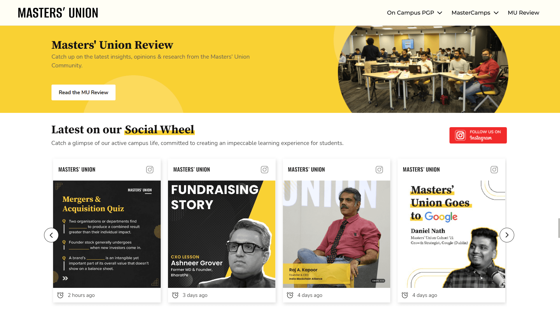
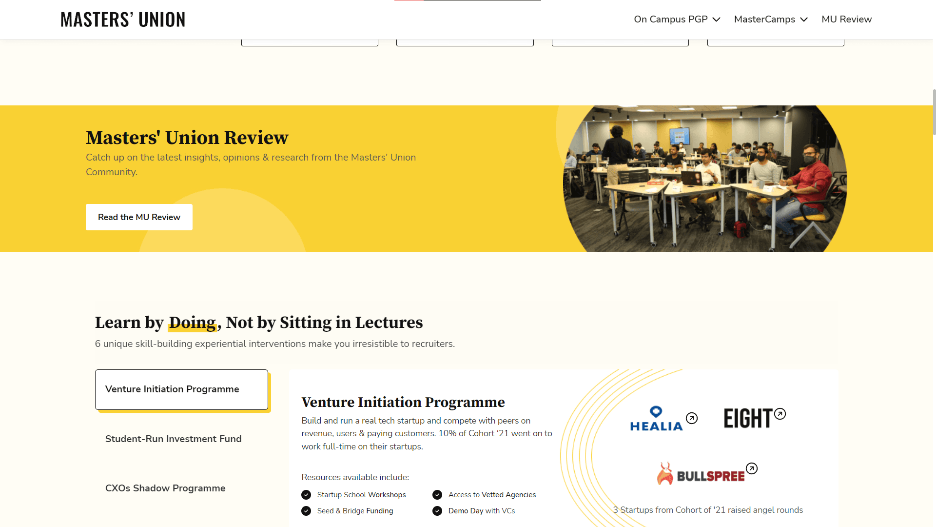
Screen 1
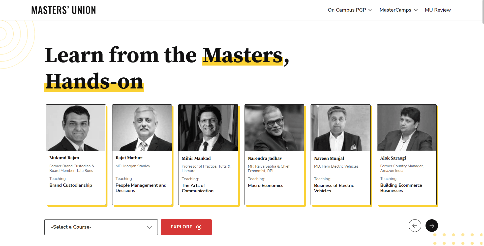
Current UI
Redesigned UI
Value Proposition
Relevant CTA
Less Visual Load
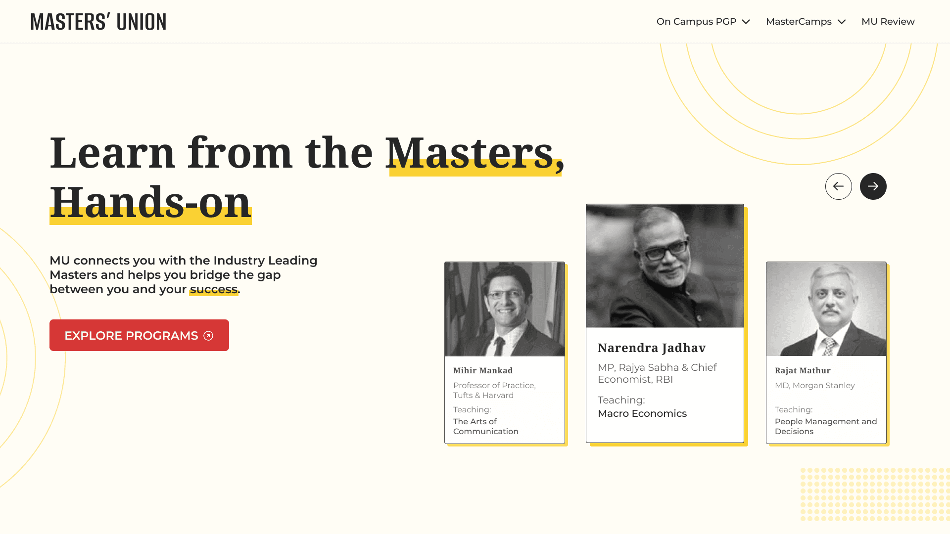
Screen 2
Redesigned UI
Consistent User Flow
Current UI
Concise Information
Easy Navigation
Better Copy
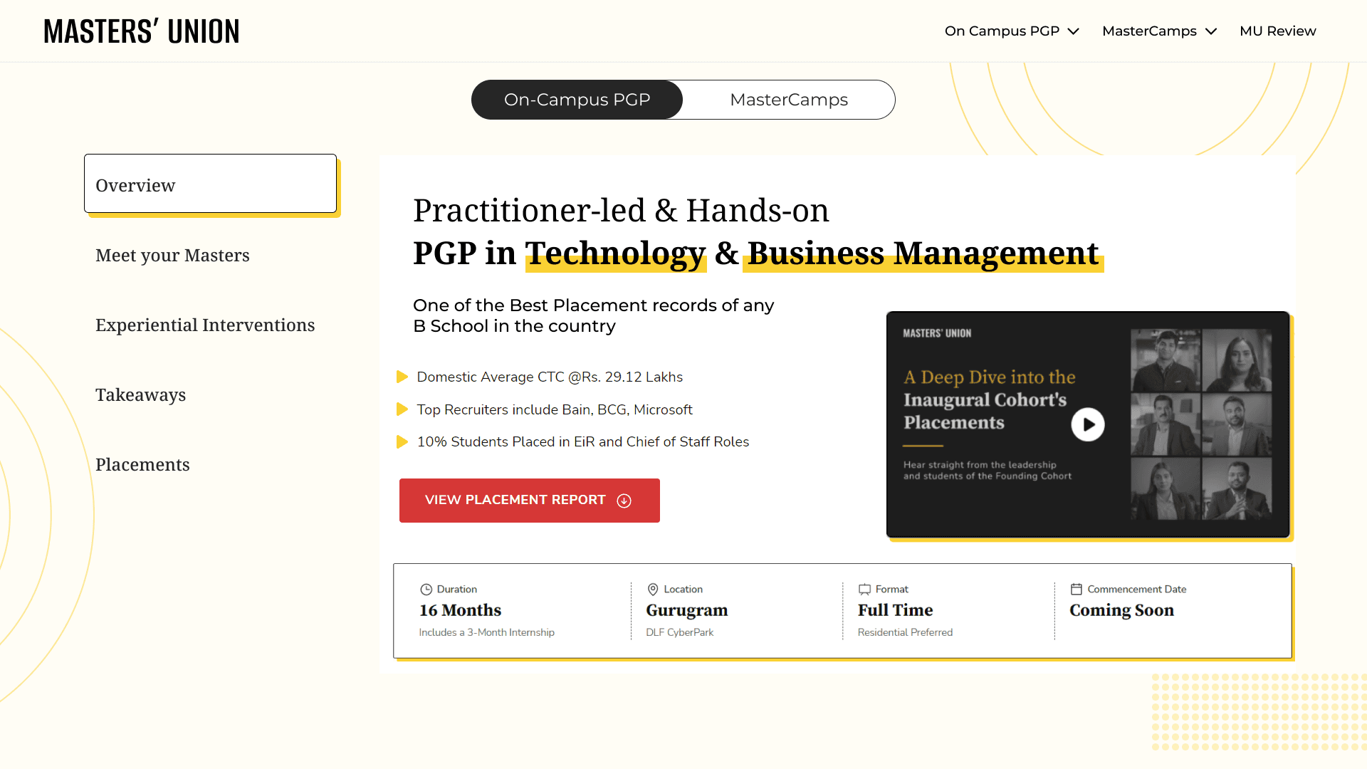
Screen 3
Redesigned UI
Current UI
Separated Secondary
Content
PROTOTYPING
Thank you for reading!